Blog

  • Design by Fire 2010… and how I learned to hate my camera

    Bill Buxton was coming to the Design by Fire 2010 conference in Amsterdam. That was the only thing I needed to hear to sign up for it. The man is a legend in the human-computer interaction field and his talks are usually very interesting, inspiring and full of great insights. Of course he did not disappoint.

    I had to stand on the back of the room where his talk was taking place, just so that I could video record the whole thing without disturbing the people sitting behind me with my camera blocking their view. He started the talk by addressing the audience in perfect Dutch and putting on the jersey of the Dutch national team with the name “Buxton” on his back, in a gesture to celebrate the fact that Oranje had trashed Sweden 4-1 the night before (you gotta love the man!). He then proceeded to delight us for about an hour with his view on what Natural User Interfaces are really all about.

    And I was a happy man! I could just enjoy the moment and would be able to review it later on in the comfort of my house to make notes and take it all in… that is IF my stupid camera hadn’t decided to break down 0,0005 seconds before the end of the talk and erase any data that had been saved so far on my SD card. Disaster! (more…)

  • Designing the new touch interface language

    Last Tuesday I attended a short presentation at the Delft University of Technology, where Kay Hofmeester (former UX manager for Microsoft Surface) told us a bit about how the Surface team tried to handle the new challenges posed by designing user interfaces under the new touch interface paradigm. I took the liberty to record it to share it with whoever is interested (Kay if you’re out there reading this, I hope you don’t mind ;-)).

    It was a very interesting lecture with some nice and concrete examples of how wrong it is to try to directly translate old user interfaces for new input devices such as touch screens.

    The Spanish speaking pointer and the Italian speaking finger

    In the lecture, Kay explains very nicely and in depth some of the main practical differences between interacting with a classical GUI and with a touch interface, but I’m gonna give it a go with my own metaphor.

    Think of the following scenario. You’ve been speaking Spanish all your life. You know the ins and outs of your language. One day you move to Italy and all of a sudden you find yourself surrounded by Italians. Sure! your Spanish might help you get by to a certain level due to the language similarities, and you (more…)

  • Design for Interaction (and the afterlife)

    A few days back, I was invited to give a short presentation at the TU Delft to the new first year students of the Design for Interaction (DfI) master of science. Apparently being a DfI alumnus working at the biggest dutch industrial design studio made me an interesting profile to talk to Delft’s future interaction designers… or maybe I was the only one who accepted to come 😉

    I was asked to talk a bit about my experience during the master, especially during my graduation project and how it’s been so far as an interaction designer “in the wild”.

    To be perfectly honest, I didn’t have much time to practice it very well, but anyway since the faculty recorded the presentation I figured “why not publish it?”. So here it is…

  • Any sufficiently advanced technology is indistinguishable from magic…

    I’ve always been fascinated with magic, the making possible of that which our mind tells us that is “clearly” impossible; those things that we are too puzzled (or narrow minded) to understand. And as I think back to some of the tech I’ve seen so far in my lifetime and the way I perceived it the first time I came in contact with it, I can’t help but agree with Arthur C. Clarke when he said that “Any sufficiently advanced technology is indistinguishable from magic”.

    When you think about it, it wasn’t that long ago that we were still baffled by the novelty of technologies like a GPS, a smoothly working multitouch surface or the controls of a Nintendo Wii, and how they had this almost magical quality to them the first time we experienced them, yet thanks to Moore’s law and the ever thriving minds of designers and engineers out there I think that things are about to get REALLY interesting and I can’t wait to see the true magic that is coming our way.

    Here are just a couple of examples of things I’ve come across lately that I’m very much looking forward to, both as a designer and as a consumer.


    (more…)

  • Why does Apple think that a stylus is a design flaw?

    “It’s like we said on the iPad, if you see a stylus, they blew it.”

    Steven P. Jobs – CEO, Apple Inc.

    I wonder why is it that Apple considers the use of a stylus as a design flaw?

    I understand where Steve is coming from and as an interaction designer I agree that a touch interface should NOT depend on the accuracy offered by a stylus to be usable, but c’mon! (more…)

  • What are tangible user interfaces?

    During the last few days, I’ve been doing a lot of internet surfing at the office in search for good examples of trends in user interface (UI) design for one of our award winning 360 Trend Reports.

    On it’s on, that is already quite a daunting task, as there are so many things out there that it’s difficult to pick and filter everything out. To top it off, there seem to be a lot of overlapping terms to define different types of interfaces which doesn’t make it any easier when you try to organize and classify them.

    But anyway, going straight to the point, one of the most interesting user interface paradigms I’ve come across not only during my search but also during my studies, is the Tangible User Interface (TUI), so I decided to dedicate this post to explaining what they are and to show a few great examples of (soon to be) products which make use of this type of interaction.

    To start up, here’s my definition:

    A tangible user interface is one in which the user interacts with a digital system through the manipulation of physical objects linked to and directly representing a quality of said system.

    The idea with TUIs is to have a direct link between the system and the way you control it through physical manipulations by having an underlying meaning or direct relationship which connects the physical manipulations to the behaviours which they trigger on the system. (more…)

  • RepRap: Be fruitful and multiply!

    “And God blessed them, and God said unto them, Be fruitful, and  multiply, and replenish the earth, and subdue it: and have dominion over  the fish of the sea, and over the fowl of the air, and over every living  thing that moveth upon the earth”

    Genesis 1:28

    I’m not a religious person at all, but this quote from Genesis illustrates very nicely the awesome powers that were bestowed by “the dude upstairs” upon that couple of naked people living in his garden: Usefulness and Self reproduction!

    This gave way to the opportunity to get more of these  naked people to walk around, do some cool things which could help themselves and others and eventually create some more naked people of their own to keep the ball rolling.

    Well this amazing power is exactly what the guys behind the RepRap project gave to their open source rapid prototyping machine. That’s right, it’s a SELF REPLICATING RAPID PROTOTYPING MACHINE! it creates useful things for us and has the ability to create a copy of itself so that others can take advantage of it too. How awesome is that?? (more…)

  • New year, new decade, new job, new city… and I get to play with robots!

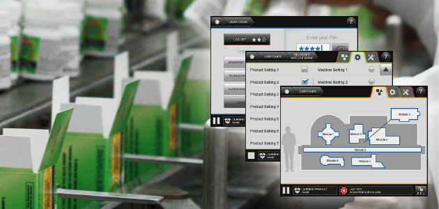
    It’s being a pretty hectic end/start of the year. As of last Monday (11th of January) I started working as Interaction Designer at VanBerlo Studios, the biggest design studio in the Netherlands and an important player in the European scene of product development.

    As a consequence and after 9 years of my life spent in the little and picturesque town of Delft I had to move to Eindhoven, a bigger city down to the south of the Netherlands, very well known for being the headquarters of technology giants Philips and home of former European champions PSV Eindhoven (I guess I can never wear my Ajax jersey in public around this town).

    The city is not as charming, but the work and the company is absolutely fantastic so far… and I get to play with robots! One of the first projects I’ll be working on deals with robotics and therefore today I paid a visit to the mechanical engineering department of the Eindhoven University of Technology (TU/e). (more…)

  • Sustainable packaging? Bring out the popcorn!

    Another way of 'recycling' packing peanuts?

    For my first post of the year I received the inspiration from a Christmas present my sister received while I was visiting her.

    I’ve always had the habit of keeping the little styrofoam packing peanuts of any package I receive so that I can reuse them whenever I have to send something out myself. It saves me money and I ensure that the material is used at least once more. Sadly though, I’m sure that this is not something that everybody does and undoubtedly most of these peanuts end up in the trash after a single use, contributing to our waste problems.

    But what’s the alternative? Well, as I mentioned, my sister received this gift during the holidays which I thought was brilliantly simple and a very nicely thought alternative. It was a little box with shower and bath soaps which used POPCORN (!!!) instead of styrofoam. (more…)

  • JFTOT: User experience design for a family of industrial lab equipment

    PAC

    Relevant keywords

    Laboratory instruments, User interface harmonization, GIO Award 2013, American Good Design Award 2013

    Design goal

    PAC commissioned VanBerlo with the task of performing a portfolio-wide harmonization of their user interfaces, based on the design and styling developed during a previous project. This harmonization was to be started with the design of JFTOT, the newest addition to their growing family of industrial lab equipment.

    Specific role & contribution

    • Project planning and management, including preparation of quotes and direct communication with client
    • On-site visits and direct communication with developers
    • Initial analysis of the benefits of a UI harmonization
    • Conceptualization and wire-framing for JFTOT’s UI
    GIO2013GoodDesign

    (more…)

  • Langen: Creating UX guidelines for industrial packaging machines

    Relevant keywords

    Industrial machinery, User interface guidelines, Packaging

    Design goal

    In an effort to bring together the user interface developments of both its European and American branches, Langen Group commissioned VanBerlo to develop a new set of harmonized UI guidelines for its products.

    Specific role & contribution

    • Project planning and management, including preparation of quotes and direct communication with client
    • Organized on-site visits and workshops with the client for an in-depth analysis of the product
    • Responsible for all conceptualization and styling activities
    • Direct communication with developers and support during production phase

    (more…)

  • VIDA Density Meter: UX design for industrial lab equipment

    PAC

    Relevant keywords

    Laboratory instruments, user interface design

    Design goal

    A more user friendly interface was required as part of the latest version of the VIDA density meter, in order to support the less experienced users that PAC is targeting with the new design of the equipment.

    Specific role & contribution

    • Project planning and management, including preparation of quotes and direct communication with client
    • On-site visits and direct communication with developers
    • Conceptualization and wire-framing
    • Overseeing of styling activities

    (more…)

  • I’ve still got it a bit 😀

    I recently discovered the newest version of Sketchbook Pro (2010) and I have to say “oh my freaking god! this is the coolest sketching program ever!”. I absolutely LOVE the simplicity and elegance of the software’s interface and I’m also very grateful that they follow the KISS principle very nicely (Keep It Simple, Stupid!) without cluttering the program with a whole bunch of tools and features that you seldom use.

    Just for kicks I made a few sketches to add to my portfolio (pretty sketches sell VERY well on an industrial design portfolio, even if that’s not what you want to focus on) and I was very positively surprised that I still have it a little bit in me to come up with decent results. So here are a few underneath… What do you think? would you hire me??? 🙂 (more…)

  • 5 principles of service design thinking

    I’ve been in contact with Marc Stickdorn ever since my MSc. graduation project, as he is an expert in service design. Well he is now working on a new book project along with some of his colleagues in which they will deal with basics, tools and service design cases.

    The interesting part of it is that the project is getting the service design community involved as co-authors of the book so to speak, and as such the book is meant to be a reflection of what “the scene” thinks.

    In order to get some feedback on the first sneak preview of a few pages from the introduction of the book called “5 principles of service design thinking“,  we at SusaGroup worked together with Marc and his colleagues in arranging a special Panoremo setup which could be used by service designers to give their feedback on the content and the layout of the upcoming book’s sneak preview pages.

    If service design thinking is your thing, I suggest you drop by at www.susagroup.com/marcstickdorn to give Marc your own feedback. (more…)

  • TEN: 10 years of Design & Emotion (Workshop Part II)

    TEN workshopA while back I wrote about the workshop organized by the Design & Emotion Society to celebrate their ten year anniversary, and I said I would make a second post explaining the rest of the workshop and the results… well, after finally making some time to sit down and go through it, here it is!

    If you haven’t read the first part, I suggest you do so here, because that will make the coming lines much more clear to understand.

    so, here it goes…. (more…)

  • Cradle to Cradle: Hype or hope?

    c2cI’ve been meaning to make a post about Cradle to Cradle (C2C) for a while and last week we had a mini-symposium about it at the TU Delft with the attendance of Michael Braungart, one of the original C2C advocates, so I figured that this was the perfect excuse to get down to it.
    So, to get started, let’s explain the C2C concept a little bit, and the best way to explain Cradle to Cradle is to first explain what Cradle to Grave means.

    Until not so long ago, our production paradigm was focused on manufacturing products as cheaply as possible which would be later discarded into landfills (in the worst case) or burned up for energy (in the best case), meaning that we were producing or processing materials (cradle) which would later be rendered useless because they were being buried or destroyed (grave) (more…)