Category: Graphic Design

  • JFTOT: User experience design for a family of industrial lab equipment

    PAC

    Relevant keywords

    Laboratory instruments, User interface harmonization, GIO Award 2013, American Good Design Award 2013

    Design goal

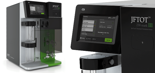
    PAC commissioned VanBerlo with the task of performing a portfolio-wide harmonization of their user interfaces, based on the design and styling developed during a previous project. This harmonization was to be started with the design of JFTOT, the newest addition to their growing family of industrial lab equipment.

    Specific role & contribution

    • Project planning and management, including preparation of quotes and direct communication with client
    • On-site visits and direct communication with developers
    • Initial analysis of the benefits of a UI harmonization
    • Conceptualization and wire-framing for JFTOT’s UI
    GIO2013GoodDesign

    (more…)

  • Langen: Creating UX guidelines for industrial packaging machines

    Relevant keywords

    Industrial machinery, User interface guidelines, Packaging

    Design goal

    In an effort to bring together the user interface developments of both its European and American branches, Langen Group commissioned VanBerlo to develop a new set of harmonized UI guidelines for its products.

    Specific role & contribution

    • Project planning and management, including preparation of quotes and direct communication with client
    • Organized on-site visits and workshops with the client for an in-depth analysis of the product
    • Responsible for all conceptualization and styling activities
    • Direct communication with developers and support during production phase

    (more…)

  • The Crisis of Credit Visualized!

    Today I came across this awesome video, and I just couldn’t wait to share it here. It’s a video made by Jonathan Jarvis explaining the oh so current and oh so cryptical crisis of credit which seems to be affecting everyone of us these days (whether we want it or not). I think it’s a great example of visual communication design at it’s best.

    Here’s what Jonathan had to say:
    The goal of giving form to a complex situation like the credit crisis is to quickly supply the essence of the situation to those unfamiliar and uninitiated. This project was completed as part of my thesis work in the Media Design Program, a graduate studio at the Art Center College of Design in Pasadena, California. For more on my broader thesis work exploring the use of new media to make sense of a increasingly complex world, visit my website www.Jonathan Jarvis.com

    Enjoy the video!


    The Crisis of Credit Visualized from Jonathan Jarvis on Vimeo.

  • Hema themed Internet Explorer

    Hema Internet explorerAs part of a visual design exercise at the TU Delft, we were given the following assignment:

    Hema has signed a contract with Microsoft and will be the first to launch its Hema own brand Internet browser onto the market. The browser will be an Hema version of Microsoft Internet Explorer 6. The contract does not allow Hema to make any modifications to the technology used or the functions provided by the browser. By enforcing these restrictions, Microsoft wants to ensure that consumers are aware that they are using a Microsoft product. As Hema does not specialise in software, it has no objections to the restrictions. The company sees no future in software that has been developed by a warehouse. On the other hand, the company has years of experience successfully marketing well-known products under Hema’s own label.

    Assignment A: Design the graphical user interface (GUI) for the Hema browser, based on the functions provided by Internet Explorer 6. Do not waste time altering any of these functions! (more…)

  • ipNext: Usability testing and redesign of an office phone

    ipNext_thumb

    Relevant Keywords:

    Telecommunications, office environment, user research, usability testing, icon validity testing, redesign, office telephone

    Design Goal:

    The goal of this project was to evaluate the usability of the Alcatel-Lucent IP Touch 4018 office phone and to propose a re-design of the phone according to the findings of the performed tests. The team consisted of 6 Design for Interaction master students of the TU Delft working directly for Alcatel-Lucent, a global telecommunications corporation.

    Project duration and team:

    225 hours, 6 interaction designers (David Güiza Caicedo, Tine Lavrysen, Amine Rhord, Meike Mak, Steven Fokkinga, Marjolein Hartog)

    Methods Used:

    • Product analysis in terms of aesthetics and functionality
    • Online user survey & interviews with experienced users to understand how they perceived the current phone.
    • Usability tests of the current phone with novice and experienced users.
    • Online icon validity test performed with an international sample of people.
    • Interaction prototyping to assess the new interaction model proposed with the redesigned phone.

    (more…)

  • Botoneria.com – Logo and website design for a Colombian button manufacturer

    Botoneria - LogoBotoneria Ltda. (formerly known as La Piacentina) is a button manufacturer in Bogota, Colombia.

    They asked me to design a new logo for them and to develop a simple website to showcase their work and production possibilities.

    The new logo was inspired by the unique mixture of creativity and technical know-how that characterizes them.

    (more…)

  • Beerbuddies: Using the personality of cartoon characters to define people’s personalities

    As a part of my Design for Interaction Master’s degree, I took part of a project called Exploring Interactions, for which I was trying to empower bartenders against unwanted behaviour in their bars.

    As a field research, I organized some group interviews with local bartenders and made use of some generative methods (such as collage making) in order to gain more information regarding their context and the interactions involved in their job, specially those regarding the customers and more specifically those involving customers showing some sort of unwanted behaviour. After thorough analysis and fiddling with different ideas, the Beerbuddies were born.

    The BeerBuddies are meant as a tool to reflect the personality and mood of bar-goers through the use of beer coasters with cartoon characters on them. (more…)

  • BeerBuddies: Empowering bartenders against unwanted behaviour

    Discover the BeerBuddies

    Relevant Keywords:

    Work, Leisure, Horeca (Hotels, restaurants, cafes), interaction, evident, explorative, involved, dominant, submissive

    Design Goal:

    To empower bartenders against unwanted behavior. The project was performed for the “Exploring Interactions” course, as part of the Design for Interaction Master of Science at the Delft University of Technology.

    Project duration:

    225 hours

    Methods Used:

    • Context mapping research through group interviews and generative methods (such as collage making) with local bartenders to gain rich visual and contextual information from them (field research).
    • Online survey to assess how people perceive the personalities of cartoon characters in terms of dominance and friendliness.

    (more…)

  • Baaramee: Interacting with a 3D island in Dubai

    Baaramee_thumb

    Relevant Keywords:3Dsolutions_logoThe_world_Dubai

    Graphical user interface, 3D environment, single point touchscreen, communication & marketing

    Design Goal:

    For the marketing and communication efforts of Baaramee, one of the islands of The World project in Dubai, an interactive 3D environment was conceived to allow possible investors and buyers to visualize and interact with the project. I was asked to develop a graphical user interface with which users could interact with the system through a touchscreen interface.

    Project duration:

    100 hours

    Methods used:

    • System flowcharts to communicate with programmers
    • Interactive concept presentation to communicate with programmers and management

    (more…)

  • Club Alpine Mulhouse – CTC logo

    The Mulhouse fraction of the french Club Alpine asked me to design a logo for a new campaign they were implementing called the Cellule Transport en Commun – CTC (Shared Transportion Cell), which encouraged their club members to use shared transportation means to the climbing trips organized by the club.

    I made these two proposals. The first one is a playful reference to the word cell in a biological sense, while giving it a transportation connotation by the shape of a bus being recognized within the cell.

    The second one was more to the point and was inspired in traffic signs.

    (more…)

  • Weirdest pregnancy icon I have ever seen

    I dont know if it looked disgusting, weird, ugly, or what… but I found an icon that I assumed was representing a pregnant woman on the floor of the preferential parking space at a local supermarket in Athens, and I couldnt resist the impulse to take a picture of it and save it for posterity.

    Enjoy!

  • Mexico2 – Logo

    Mexico 2 was a proposed new business citadel to be constructed in the heart of Mexico which would become a new focus of economic importance for the whole of the Americas.

    At 3D capacity, we were approached to work on the visualization of the project and as part of it I designed this logo. It is based on the idea of the new citadel being a focus point of the Americas and as can be seen the X is an abstraction of a map of the entire continent. The number 2 is placed as superscript to show that Mexico 2 is not merely seen as a second version of something but as an exponential enhancement of the current status. The colours used are the national colours of Mexico (namely red, white and green). The X2 can also be used as a separate image that still conveys the proposed message without including the text Mexico on it as can be seen to the left.

    (more…)

  • 3D capacity – Flash based project management system

    This is a project management system that I put in place for 3D capacity‘s website. It is made in flash supported by xml files containing the project data. With it, it was possible to keep all the relevant information (delivery dates, contacts, file folders and communication) in a single place for both 3D capacity staff, as well as for the clients.

    By clicking on the screen-shots below you can see a demo of how it works (except for the possibility to save data which is not supported).

    (more…)

  • Club Alpine Mulhouse – T-shirts

    The Club Alpine Mulhouse asked me to design a T-shirt for the club which can be used by club members during the different outdoor activities that are regularly organized.

    I designed this T-shirt which can be made in two different colours:

    (more…)

  • Icons for various applications

    Over the years, I’ve designed a series of icons for different applications, such as being used within websites or graphical user interfaces. This is a collection of some of them.

    Icons 01 (more…)

  • Imagine – an exercise on visual corporate identity

    Imagine - 01During a course at the TU Delft as part of my Industrial Design Engineering BSc., we were asked to work in a design assignment in a group as if we were an actual design studio working for a given client.

    As part of the exercise, we had to develop a corporate identity for our studio and use it at all times during the course’s process.

    I designed a logo, website, powerpoint starting screen, business cards and even a promotional gift (a mug).

    (more…)