Last weekend I took part of Accenture’s Digital Hackathon, a global event organised by Accenture (Duh!) in which more than 400 participants from 8 cities around the globe would try to think of and complete a project within 24 hours under the umbrella theme of “Connect. Collaborate. Create”.
It was my first time at a hackathon and although it required a lot of energy and very little sleep, it was lots of fun and quite an experience with very interesting results from all the talented people who participated. (more…)
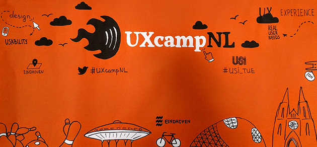
This past weekend I felt like mingling with my peers of the UX design community and check out what they’re up to, so I decided to attend this year’s UXCampNL in Eindhoven. The event, as they put it themselves, is an “unconference born from the desire to bring together the industry and academic communities to share knowledge in an open environment”.
Unlike a traditional conference, UXcamp is shaped by the attendees themselves. Anyone willing to contribute and learn is welcome to join and give a talk, workshop or start a discussion.
So here’s my take on how things went down… (more…)
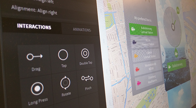
I’ve been looking recently into playing a little bit more with new tools meant for digital designers like myself. Don’t get me wrong, I am perfectly happy with my Illustrator/Visio/Flash combo for all my UI/Workflows/Prototyping needs, but I figured it’s always good to keep your eyes open for new toys. So long story short, while browsing through Google’s Design Blog I came across Pixate (since apparently they were recently acquired by Google) a fairly new prototyping tool for mobile (Android and iOS) which seemed worth a try.
I’ve been meaning to make a post here about what we define as “Design for Interaction” at the TU Delft, but since I just came across this video, my life was made soooo much easier, because they explain it beautifully. So, there, for anyone wondering what exactly it is that I and my fellow DfI’ers do, here’s a perfect explanation 🙂
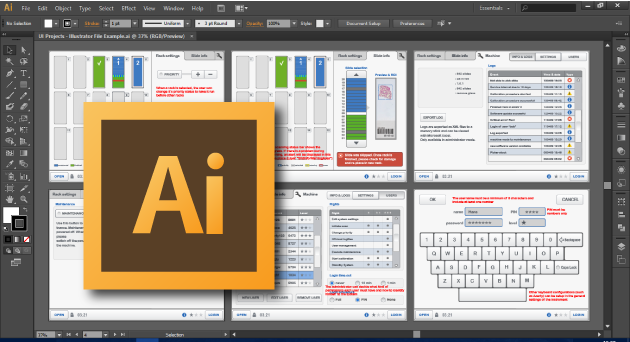
As a creative professional working on Graphical User Interfaces (be it for products, apps or websites) you are bound to come in contact with Adobe Illustrator, the leading vector graphics package out there. It’s an amazingly handy piece of software, that when used correctly, can make your whole workflow a breeze.
In the past, I created a handy manual for the design teams I’ve worked with, highlighting some of the best practices I’ve gathered through my experience working with it, and I figured it was time to share it with the rest of the world, you know… because sharing is caring 😉
Serious gaming is a trend that we at Novility are tackling head-first with our training initiatives. It relies on the idea of using gaming principles applied to more serious goals such as proper training of personnel, in a way that keeps the trainees more engaged and focused on the subject matter, while achieving higher standards and competencies.
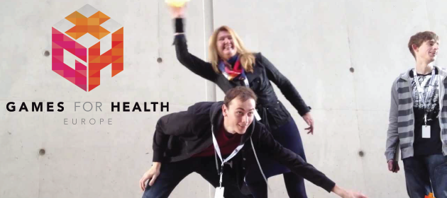
This trend has found its way into many domains and industries, with health being one of the fastest growing focus points of the serious gaming community. Proof of this is the Games for Health Project, an initiative supporting community, knowledge and business development efforts to use cutting-edge games and game technologies to improve health and health care. The 10 year old project celebrated this year the organization of its 9th annual Games for Health Conference in Boston (USA), and is quickly opening other chapters worldwide to encourage the spreading of their ideals.
Google just released a video for Project Glass, one of their Google[x] projects dealing with augmented reality deployed through a set of glasses (or a similarly placed gear).
Some have been quick to pinpoint some of the technical problems faced by the project, but of course, we should take the video with a pinch of salt, as it is but a concept design to illustrate what their vision is with the whole thing.
What I really find interesting about it, is that Google is thinking of a true Augmented Reality application. Forget about the bullshit, gimmicky AR applications in which you must point something to a camera and see a 3D model being put in it’s place while you watch yourself on a screen, what we are talking about here is more akin to Layar, but then without the awkward interaction of having to see things through a small “window” (your mobile device), instead you get to see everything in your own field of view. (more…)
As an industrial design student, I remember that I had a hard time during sketching classes. Not because I can’t doodle, but because I was asked to “sketch” and NOT to “draw“, which is quite a different thing.
Sketching is all about conveying the message in a quick and simple way; a tool designers use to quickly explore possibilities. And my biggest problem was always that I wanted to draw, to end up with a presentation drawing as close to my intention as possible, no room for error. I had the hardest time committing to a stroke because I felt it had to be perfect or not be at all, and of course I hated the fact that they were forcing me to sketch with ink fine-liners (not much erasing there I’m afraid…). It was quite frustrating and up to this day I’m bugged by it.
But a recent game on the mobile front might help me change that. (more…)
A few days back, I was invited to give a short presentation at the TU Delft to the new first year students of the Design for Interaction (DfI) master of science. Apparently being a DfI alumnus working at the biggest dutch industrial design studio made me an interesting profile to talk to Delft’s future interaction designers… or maybe I was the only one who accepted to come 😉
I was asked to talk a bit about my experience during the master, especially during my graduation project and how it’s been so far as an interaction designer “in the wild”.
To be perfectly honest, I didn’t have much time to practice it very well, but anyway since the faculty recorded the presentation I figured “why not publish it?”. So here it is…
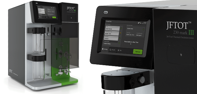
Laboratory instruments, User interface harmonization, GIO Award 2013, American Good Design Award 2013
Design goal
PAC commissioned VanBerlo with the task of performing a portfolio-wide harmonization of their user interfaces, based on the design and styling developed during a previous project. This harmonization was to be started with the design of JFTOT, the newest addition to their growing family of industrial lab equipment.
Specific role & contribution
Project planning and management, including preparation of quotes and direct communication with client
On-site visits and direct communication with developers
Initial analysis of the benefits of a UI harmonization
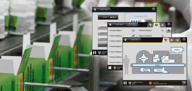
Industrial machinery, User interface guidelines, Packaging
Design goal
In an effort to bring together the user interface developments of both its European and American branches, Langen Group commissioned VanBerlo to develop a new set of harmonized UI guidelines for its products.
Specific role & contribution
Project planning and management, including preparation of quotes and direct communication with client
Organized on-site visits and workshops with the client for an in-depth analysis of the product
Responsible for all conceptualization and styling activities
Direct communication with developers and support during production phase
There’s a reason why Delft is ranked as the 15th best engineering university in the world, and god, you gotta love them for that!
In Australia, only a crash 3 weeks before the start of the race managed to keep Nuna 5 from being the top dog of the World Solar Challenge so far… After a speedy crash recovery operation, we’re still third by the second day of racing and breathing down the neck of second placed University of Michigan. But watch out Tokai University (leaders so far) ’cause the Nuna team went to Australia to claim their rightful place and beat the competition for the 5th time in a row.
[UPDATE: As of October 27th, Nuna 5 has already surpassed the car from the University of Michigan, so Tokai is next!]
And back in Delft, the Design and Engineering Award is underway with some very, VERY interesting stuff going on.
On this post, you can find a couple of my favourite videos of some of the participating projects from our different faculties, which are just to show off a bit of why Delft is soooo cool 😉 (more…)
The welcoming image I found at Helsinki's airport. Don't forget to read the caption 😉
I arrived today to Helsinki, where I’ll be attending and giving a small presentation at the EuroCHRIE 2009 Conference which has “experience in the hospitality and tourism industry” as it’s theme this year. Why am I presenting you say? Well, I’ll be talking about part of what I did during my graduation project and introducing the hospitality industry to Panoremo.
I’ll be posting a bit more about the conference in the coming days.
Unfortunately my hotel room (although very nice, pretty and cozy) does not have a very nice view… in fact all I see is the building on the other side of the street. So I can’t really publish any pics of Helsinki right now, but I did find the picture you see here at the airport which I thought was hilarious.
In case you missed the caption it reads:
“Finns are good at for example driving fast, skiing fast, ice-hockey and curling but we’re pretty good at creating new sports too. Judge yourself: Eukonkanto: Wife Carrying competition through an obstacle course. Saappaanheitto: Throwing a rubber boot. Kannykanheitto: Throwing an old mobile phone. Suopotkupallo: Football on a swamp.”
…I think I’m gonna have a bit of fun in this place 🙂
Last Thursday I finally received the green light from my graduation supervisory team, which in fact means that they are confident that I will be able to finish up my MSc. graduation project within the coming 6 weeks and that no matter what, on the 26th of June somewhere in the afternoon, I will finally be leaving my eternal student status behind to officially adopt my new role as a jobless professional with a Master’s degree (albeit, hopefully for not too long).
So anyway, if there are people out there in the Netherlands (or the vicinity) who are interested in the project (“Developing a tool to assess emotions elicited by services”), I will be performing a public presentation of the project on the 26th of June, at the Delft Univeristy of Technology. More details regarding location and time will come shortly.
A couple of days ago, I decided to go with Evula to one of Holland’s main spring atractions… the Keukenhof gardens. Filled with thousands and thousands of blooming flowers of any imaginable color, it was quite a spectacle to see.
But what caught my attention the most, were not the tulips, or the orchids, or anything of the like… it was this Buddhist monk, who’s “lifestyle is shaped so as to support his spiritual practice, to live a simple, happy and meditative life, and attain Nirvana”.
Wikipedia (the new “Holy bible”), tells us that the robes of a Buddhist monk come from “the idea of wearing cheap clothes just to protect the body from weather and climate…. Since dark red was the cheapest colour in Kashmir, the Tibetan tradition has red robes. In the south, yellow played the same role“.
Pay close attention to the fact that they DO NOT mention ANYTHING about the shoes… so our monk decided to follow his vouws in style, with some very cool Pumas that match his ‘raggedy-poor-man’s-robes’
I came across this little story on the internet and I thought it was absolutely brilliant, so I decided to reproduce it here for anyone out there waisting their time reading this page.
"There's no doubt about it. We picked up several from different parts of the planet, took them aboard our recon vessels, and probed them all the way through. They're completely meat."
"That's impossible. What about the radio signals? The messages to the stars?"
"They use the radio waves to talk, but the signals don't come from them. The signals come from machines." (more…)


 There’s a reason why Delft is ranked as the


